


About the project
This is my personal project, and what you can see here is my interpretation of the covers of some of my favorite albums. I was aiming to capture the essence of the music through visual art. While creating these reimagined album covers, I explored and employed abstract art, and various design elements and principles, such as contrast, and the feeling of rhythm and composition.

About this album
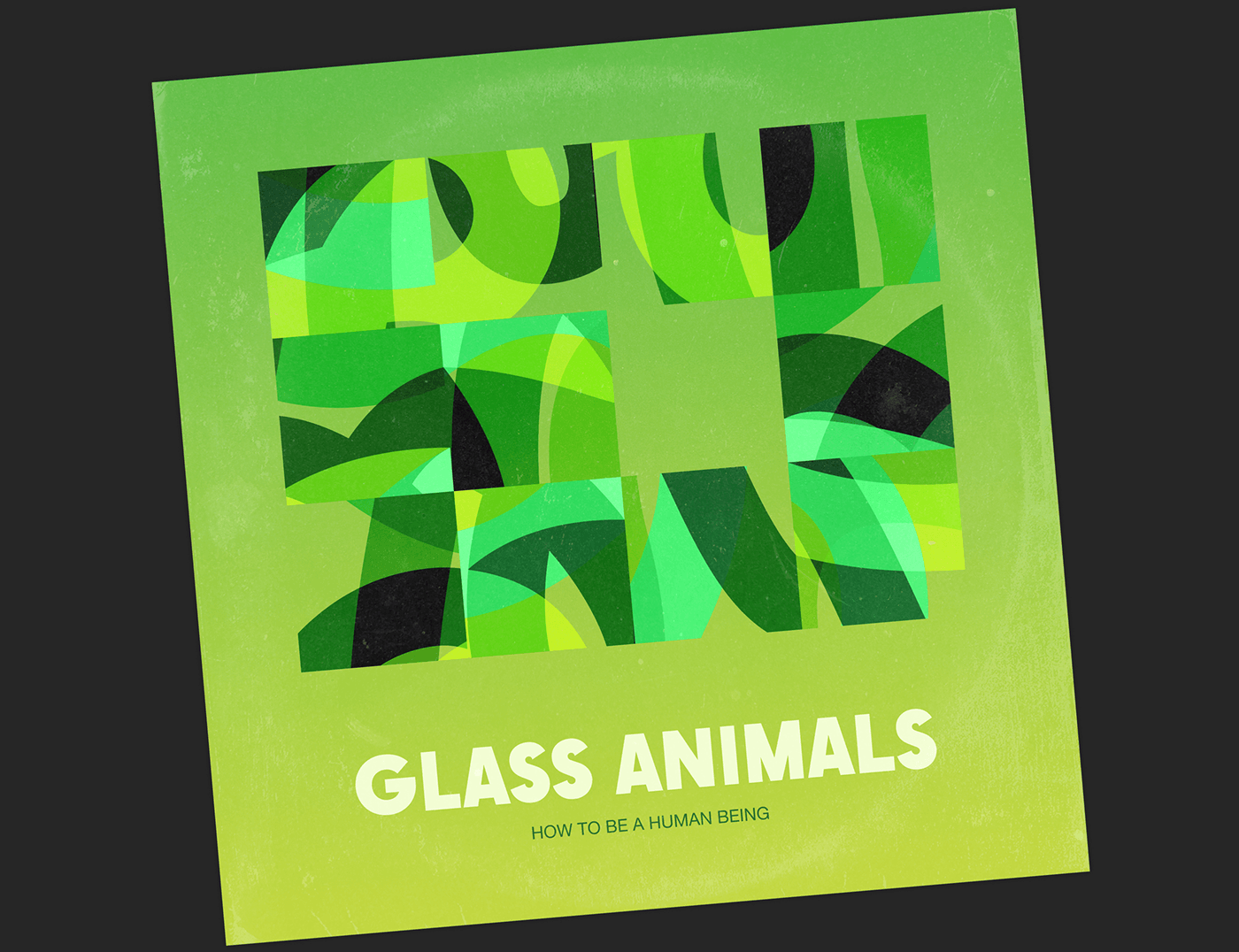
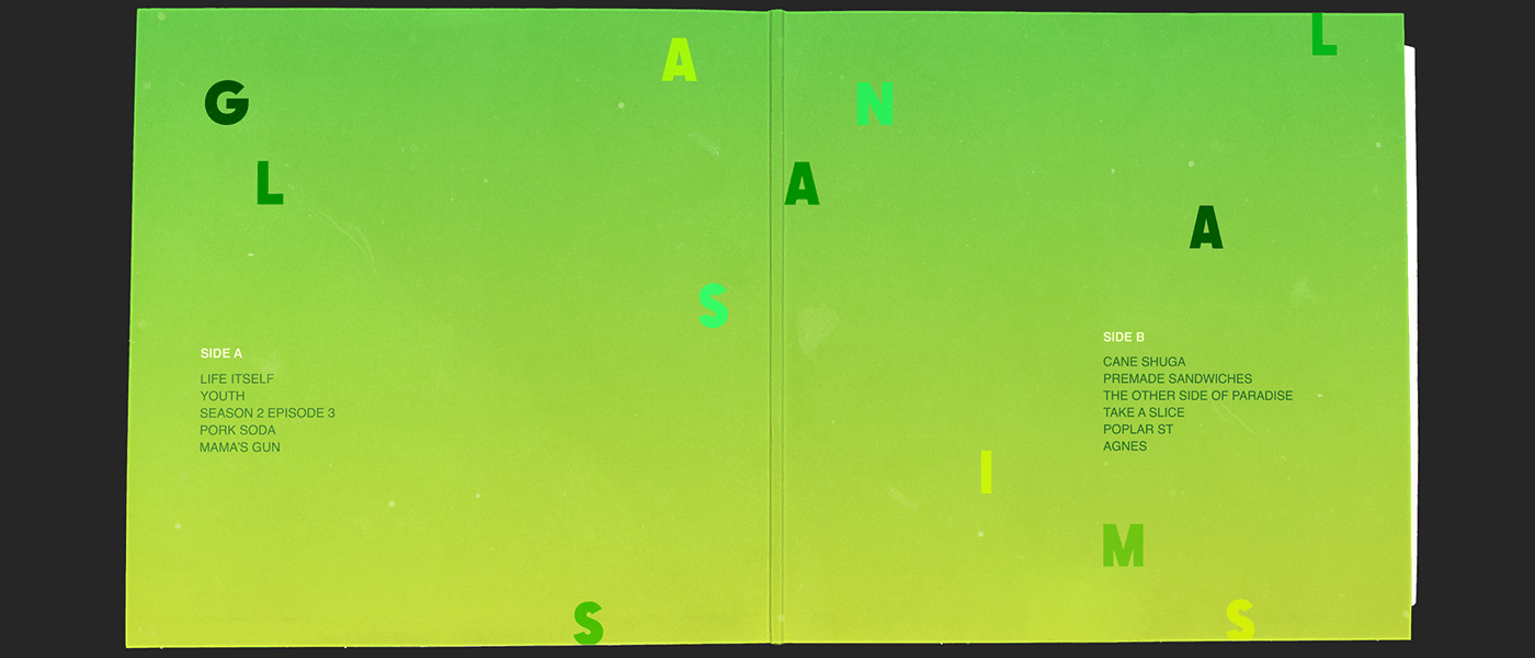
The concept for this album was inspired by the band's history about it. While their promotion tour for their previous album, Zaba, the band wrote 11 songs, each based on a different character, many of whom were inspired by people they met and stories they were told during their tour. The album cover features 11 squares arranged in a puzzle-like formation, representing the 11 characters, with lines inside symbolizing the connections and stories between them.
I chose a green color for this album because it is associated with the heart chakra, which felt fitting for an album about people. Additionally, I associate the band Glass Animals with jungles, and green is a color often found in natural, lush environments.
I chose a green color for this album because it is associated with the heart chakra, which felt fitting for an album about people. Additionally, I associate the band Glass Animals with jungles, and green is a color often found in natural, lush environments.


About this album
The concept for this album was developed through a meticulous process. I wrote down associations for each song and collected words that would describe the overall feel of the album. Based on those words I have created the art. Additionally, I took into account the design era of the period when the album was released (when music was connecting people which you can also notice in the design).
The main word associations included "flashes, thin strings, breaking down, smoke, fluid, one merges with another, heart."
I also spent a significant amount of time deciding on the color palette for the cover and ultimately chose black and white with a super neon record inside, to allow each listener to interpret the album's color and the trip they are taking in their own way, and at the same time show that every individual could find something amazing within the album.
Below I will show two of the million color options I liked:


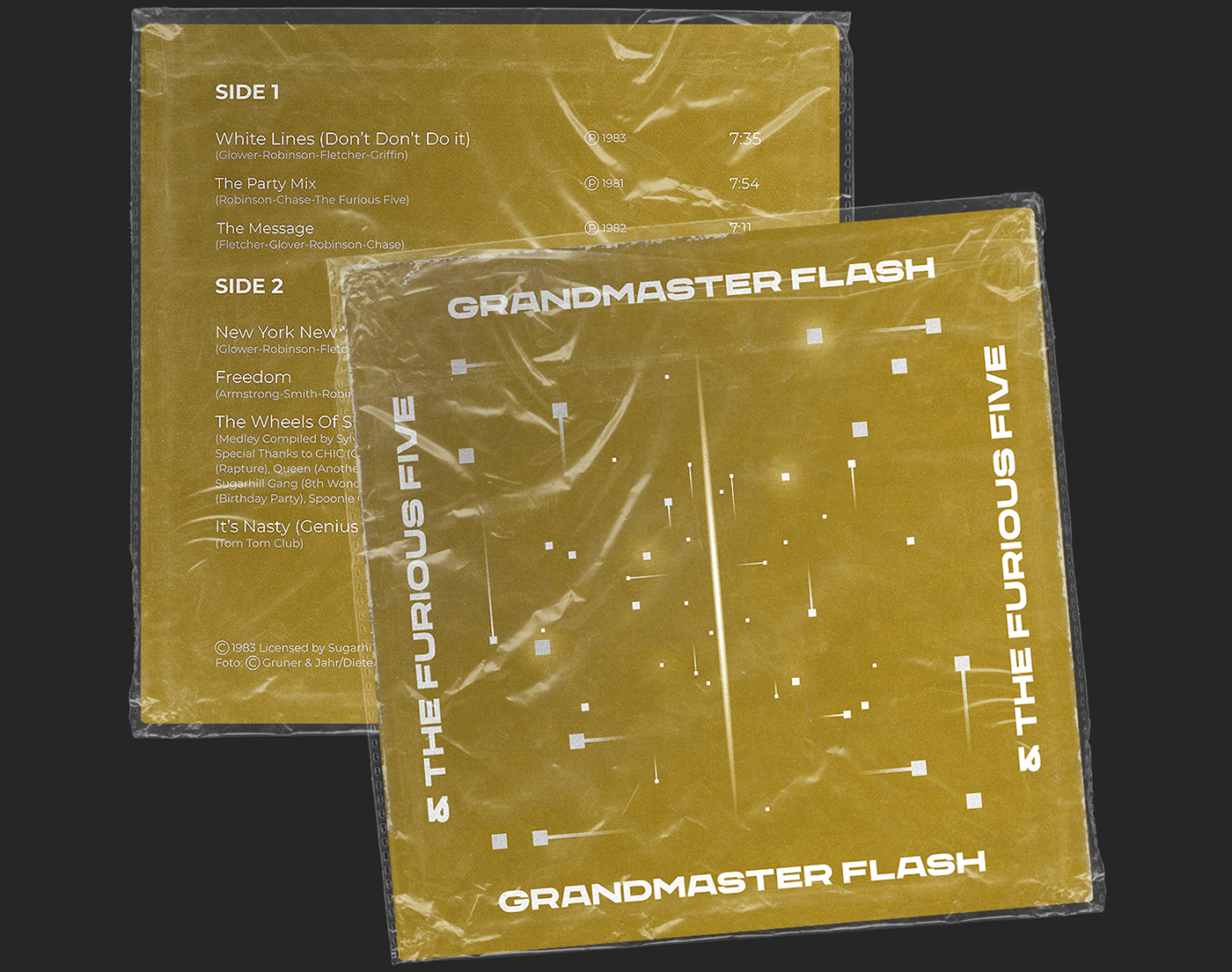

About this album
I used the same method of associations here as in the previous concept (above). I wrote down associations for each song and collected words that would describe the overall feel of the album.
I’ve collected word associations of each song into the overall feel to create the cover art. This album feels to me as dynamic, rhythmic, and sharp. There is also an easter egg here...the sparkling “squares” form a Capricorn constellation and this is Grandmaster Flash’s sign.
The main word associations included "appearing and disappearing, satellites, spiral, dreamy, sound wave or sound bars, spontaneous, glitchy."


Here are Spotify links to these albums, so you can connect music with the visuals:


Thank you for your attention!
You can contact me here (:


